The most celebrated interior designers don't just create beautiful rooms - they develop a visual language so distinctive that a single photograph reveals the hand behind it. Two designers who exemplify this are Kelly Wearstler, known for her bold, graphic, almost theatrical approach to interiors (with wallpaper playing a starring role), and Suzanne Kasler, celebrated for her effortlessly refined elegance and masterful use of lighting to create atmosphere.
This guide explores both designers' signature philosophies and, more importantly, shows you how to translate their approaches into your own home. You don't need a designer's budget to channel designer-level thinking. By understanding the principles behind their iconic work - Kelly Wearstler's fearless approach to pattern and texture, Suzanne Kasler's disciplined elegance and lighting strategy - you can create interiors that feel purposeful, confident, and distinctly personal.
Kelly Wearstler: The Power of Bold, Graphic Interiors
Kelly Wearstler has built a global reputation on interiors that refuse to play it safe. Her work for hotels like the Proper Hotel chain, the Viceroy, and her own residential projects showcases an aesthetic that combines mid-century forms, geological textures, graphic patterns, and unexpected color relationships into spaces that feel energetic, luxurious, and absolutely singular.
Core principles of Wearstler's approach:
Pattern as architecture. In Wearstler's interiors, pattern isn't an afterthought - it's structural. Her use of wallpaper, in particular, demonstrates how a bold pattern can define a room's character as powerfully as any architectural feature. A graphic wallpaper in a Wearstler space isn't decorating a wall; it's creating an environment. The pattern becomes the room's dominant visual experience, with furniture and objects selected to complement or constructively contrast with it.
Material maximalism. While minimalist design limits material variety, Wearstler embraces material abundance. A single room might combine marble, brass, velvet, leather, hand-glazed ceramic, rough stone, and polished wood. The key to making this work is that each material brings a distinct textural quality - the combination creates richness, not chaos, because every material earns its place through contrast.
Confident color. Wearstler uses color with conviction. She's known for combining tones that conventional wisdom would consider clashing - rust with pink, emerald with mustard, electric blue with terracotta. These unexpected combinations work because they're deployed with careful attention to proportion and balance.
Art and objects as equals. In Wearstler's spaces, artwork, sculpture, and decorative objects are given the same design weight as furniture. A hand-formed ceramic sculpture might be the most important element in a room. A stack of geological specimens becomes a design moment. This elevation of objects rewards the kind of careful, one-piece-at-a-time collecting that creates truly personal interiors.
Kelly Wearstler Wallpaper: How to Use Bold Pattern Like a Pro
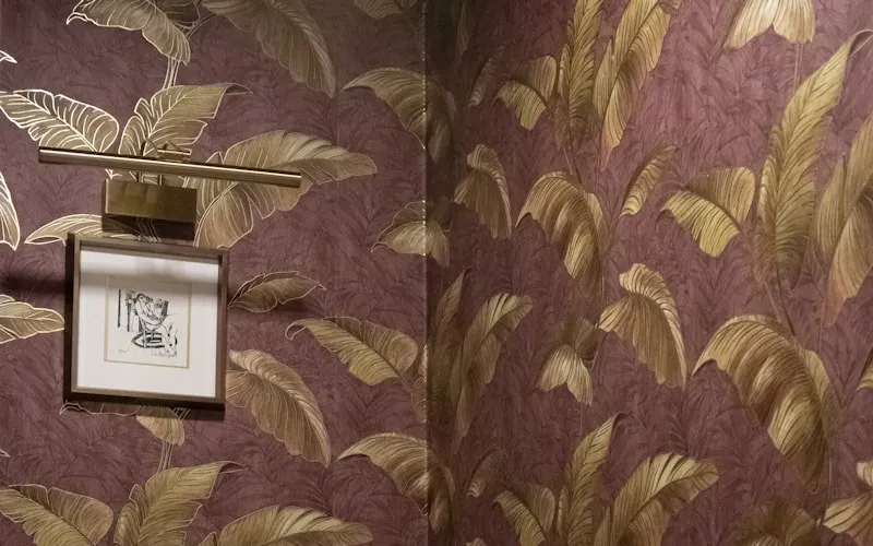
Kelly Wearstler's wallpaper designs - and her use of wallpaper in interiors - represent some of the boldest pattern work in contemporary design. Her collections feature graphic geometric forms, organic stone-inspired patterns, and abstract compositions that transform walls into canvases. Here's how to bring this approach into your own space.
Choose pattern with conviction. The most common wallpaper mistake is choosing a pattern that's "sort of bold" - too busy to be subtle but too timid to be dramatic. Wearstler's approach teaches us to commit. If you're going bold, go genuinely bold. A large-scale geometric, a dramatic marble-effect, or an abstract organic pattern at generous scale makes a confident statement. Half-measures read as indecisive.
Let wallpaper lead the design. In rooms where you use statement wallpaper, design everything else in response to it. Pull colors from the pattern for upholstery and accessories. Choose furniture with clean lines that won't compete with the pattern. This doesn't mean the room becomes monotone - it means the wallpaper establishes the visual framework that everything else references.
Pair bold pattern with textural contrast. Wearstler consistently pairs graphic wallpapers with richly textural objects - rough ceramics, nubby woven textiles, organic forms in natural materials. This contrast between the graphic flatness of the wallpaper and the three-dimensional texture of furnishings creates visual depth that keeps the room interesting from every angle.
Consider strategic placement. You don't need to wallpaper every room to achieve Wearstler-level impact. A single wallpapered powder room, an accent wall in an entry hall, or a papered ceiling in a bedroom can create a memorable design moment without overwhelming. Smaller spaces often make the boldest wallpaper choices more accessible - a powder room is a perfect place to experiment with a pattern you might find too intense for a living room.
Complement with handcrafted objects. Bold wallpaper patterns benefit from the counterpoint of organic, handmade objects. A hand-thrown ceramic vase against a geometric wallpaper, or a handcrafted pendant lamp dropping in front of an abstract pattern, creates the kind of designed-but-not-overdone quality that characterizes the best designer-inspired spaces.
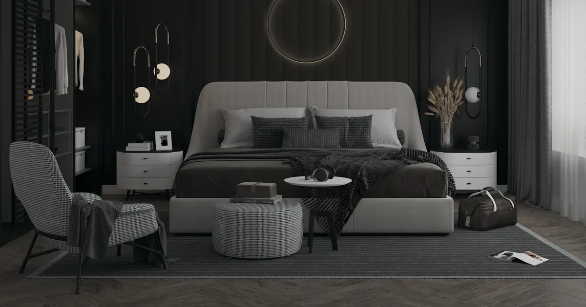
Suzanne Kasler: Refined Elegance & Timeless Grace
If Kelly Wearstler represents the bold end of the design spectrum, Suzanne Kasler occupies the equally compelling territory of refined restraint. Based in Atlanta and celebrated for both residential interiors and her lighting collections for Visual Comfort, Kasler creates spaces that feel effortlessly elegant - layered, luminous, and deeply livable.
Core principles of Kasler's approach:
Edited abundance. Kasler's rooms are rich in detail but never cluttered. She layers furniture, textiles, books, art, and objects in a way that feels generous but composed. The key is her rigorous editing - every element is considered, and nothing remains that doesn't contribute to the whole. This is abundance through curation, not accumulation.
Neutral foundations with depth. Kasler works primarily in neutral palettes - creams, taupes, soft grays, warm whites - but her neutrals are never flat or boring. She achieves depth through texture variation (matte beside sheen, rough beside smooth), tonal layering (multiple shades of the same neutral family), and strategic moments of stronger color (a blue pillow, a green botanical, a brass accent).
Classical proportions, contemporary comfort. Kasler's work draws from classical architecture and traditional design - she loves architectural moldings, symmetrical arrangements, and classical furniture forms - but her spaces feel contemporary in their comfort and livability. This balance between heritage and modernity gives her interiors a timeless quality that doesn't feel stuck in any particular era.
Lighting as design. More than perhaps any other contemporary designer, Kasler understands the transformative power of lighting. Her namesake lighting collections are characterized by graceful proportions, warm materials (particularly iron, brass, and natural fibers), and forms that serve as sculpture when illuminated and off. In her interiors, lighting fixtures aren't afterthoughts - they're anchor pieces that define a room's personality.
Suzanne Kasler Lighting: Mastering Illumination & Atmosphere

Suzanne Kasler's approach to lighting offers a masterclass in how illumination shapes the emotional quality of a space. Her lighting designs and her strategic use of light in interiors demonstrate principles that anyone can apply.
Choose lighting fixtures as furniture. Just as you'd invest time selecting the right sofa, invest equal care in choosing light fixtures. A beautifully proportioned chandelier or pendant becomes a room's visual anchor - it establishes scale, sets tone, and draws the eye upward, making spaces feel taller and more gracious. Handcrafted lighting fixtures in natural materials embody this philosophy perfectly - they're objects of beauty whether lit or unlit.
Scale lighting to the space. One of Kasler's strengths is her ability to choose fixtures at the right scale. A common mistake is hanging fixtures that are too small for their space, creating a tentative, underwhelming effect. In general, a dining room chandelier should be approximately one-third the width of the table. A pendant in an entry should be proportional to the entry's height. Don't be afraid of generous scale - a confidently sized fixture reads as intentional, not oversized.
Layer warm light at multiple heights. Kasler's interiors always feature light sources at several heights: overhead fixtures for ambient light, table lamps on surfaces for mid-level warmth, floor lamps for reading areas, and candles or low accent lights for evening atmosphere. This layering creates the warm, dimensional quality that flat overhead lighting cannot achieve. Choose warm white bulbs (2700-3000K) to maintain the inviting warmth that characterizes refined, elegant interiors.
Use pairs and symmetry. Kasler frequently uses matched pairs of lamps - flanking a sofa, beside a bed, on a mantelpiece. This symmetrical placement creates visual order and a sense of establishment that reads as elegant and considered. Matching table lamps on either side of a sofa is one of the simplest ways to elevate a living room from casual to refined.
Natural material fixtures. Kasler's designs often incorporate natural and organic materials - woven shades, iron frames, linen-wrapped cords, wooden elements. These materials create warm, diffused light and add textural interest. A handwoven pendant light in natural fiber produces a quality of light - warm, filtered, pattern-casting - that no glass or metal fixture can replicate. Pair these organic fixtures with natural textile lampshades for consistent material warmth throughout a room.
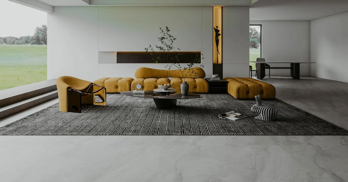
Blending Bold and Refined: Finding Your Personal Balance
The beauty of studying designers like Wearstler and Kasler is that their approaches aren't mutually exclusive. Most people's ideal interior falls somewhere between fearless maximalism and graceful restraint. Understanding both allows you to calibrate your own position on the spectrum.
Start refined, add bold moments. If you're more naturally drawn to Kasler's elegance but admire Wearstler's courage, begin with a refined neutral foundation and introduce bold elements selectively. A Kasler-esque living room with its layered neutrals and graceful lighting can accommodate a single Wearstler-inspired element - perhaps a striking wallpapered accent niche, a dramatically patterned cushion, or an unexpected color in a piece of artwork. The refined setting makes the bold moment more impactful.
Use materials as the bridge. Both designers share an appreciation for material quality, despite their different aesthetics. Natural, handcrafted materials work equally well in bold and refined settings. A hand-thrown ceramic vase belongs as comfortably in a Wearstler-inspired vignette (where its organic form contrasts with graphic wallpaper) as in a Kasler-inspired tableau (where its subtle texture adds depth to neutral surroundings). Rattan furniture bridges both worlds - structural enough for bold rooms, natural enough for refined ones.
Let different rooms have different energies. There's no rule requiring every room to have the same design intensity. A boldly wallpapered entry hall can give way to a serene, Kasler-esque living room. A dramatic powder room can sit alongside a restrained master bedroom. This variation creates a journey through your home - each room a different experience, unified by consistent material quality and your personal aesthetic sensibility.
Accessorize across the spectrum. Your decorative accessories and textiles can shift between bold and refined depending on context. A strongly textured, sculptural object reads as Wearstler-bold. The same category of object in a quieter form reads as Kasler-refined. Build a collection that includes both registers, and you can adjust a room's personality through styling alone.
Practical Guide: Implementing Designer-Inspired Design at Home
Translating designer inspiration into your own home requires adapting principles to your reality - your budget, your space, your lifestyle. Here's a practical room-by-room approach.
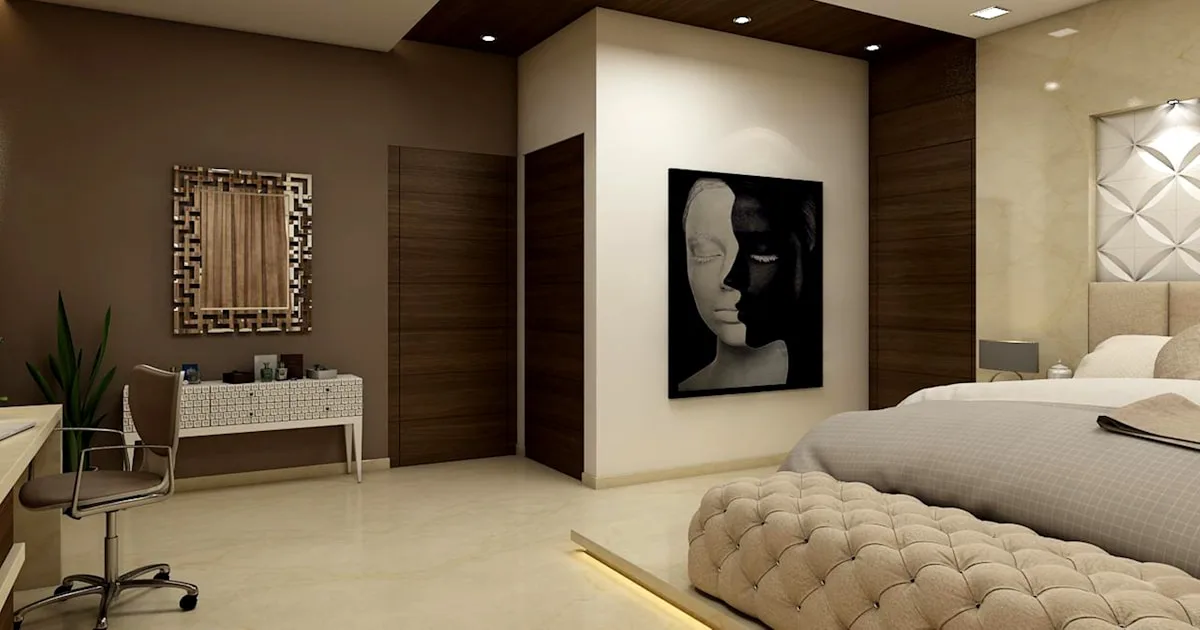
The entry. Both Wearstler and Kasler treat entries as design statements - the first impression of a home's aesthetic. A bold wallpapered entry (Wearstler-inspired) or a beautifully lit entry with a graceful console and mirror (Kasler-inspired) sets the tone. Even a small entry benefits from intentional design - a handcrafted storage basket, a quality light fixture, and a single decorative object announce that this home was designed, not just furnished.
The living room. This is where your personal balance between bold and refined plays out most visibly. Wearstler-inspired: choose a statement sofa in an unexpected color, layer patterned cushions, and add dramatic wall art. Kasler-inspired: neutral upholstery, matching table lamps, layered throws, and a refined color palette with one or two carefully placed accent colors. Either approach benefits from handcrafted accessories that add authenticity - ceramic vessels, carved wooden stools as side tables, and natural textile throws.
The bedroom. Most people instinctively prefer a calmer bedroom, making Kasler's approach particularly relevant here. Focus on luxurious bedding in neutral tones, symmetrical bedside lamps, and minimal but quality accessories. If you want a Wearstler moment, do it behind the bed - a bold headboard or wallpapered feature wall that you see when entering but that doesn't overstimulate when you're falling asleep.
The dining room. This is an ideal space for a statement lighting fixture - the single element that both designers would agree anchors the room. A generous, beautifully crafted pendant or chandelier above the dining table defines the space. Complement it with simple, quality tableware, natural linen table textiles, and a few well-chosen decorative pieces. A striking ceramic vessel as a centerpiece draws the eye without obstructing conversation.
Budget priorities. If you're working within constraints, allocate your budget the way these designers would: prioritize lighting fixtures (they change everything), one or two handcrafted anchor pieces (they provide character no mass-produced item can match), and quality textiles (they make everything feel elevated). Generic furniture with exceptional accessories always outperforms expensive furniture with generic accessories.
Designer-inspired interiors aren't about copying someone else's work - they're about learning to think the way great designers think. Kelly Wearstler teaches us to be bold, to trust unexpected combinations, and to treat pattern and texture as primary design tools. Suzanne Kasler teaches us that restraint is its own form of luxury, that lighting can transform an ordinary room into a gracious one, and that timeless quality never goes out of style.
The best version of your home draws from both sensibilities, calibrated to your own personality and lifestyle. Start with the elements that have the biggest impact - lighting, a few handcrafted anchor pieces, and quality textiles - and build from there.
Explore our handcrafted lighting collection for fixtures that embody Kasler's philosophy of lighting as design. Browse our natural textiles and artisan ceramics for the material richness that both Wearstler and Kasler champion in their work.
Frequently Asked Questions
Enjoyed this guide?
Share it with someone who'd find it useful