Interior painting design is one of the most powerful, accessible, and cost-effective ways to transform your home. A single coat of paint can shift the mood of a room from cold to cozy, from cramped to expansive, from forgettable to stunning. Yet choosing the right colors and techniques can feel overwhelming when faced with thousands of options.
This guide cuts through the noise. Whether you are planning a complete home repaint or looking for a single accent wall to revitalize a room, we cover everything from color psychology and current palettes to advanced painting techniques and the art of pairing painted walls with natural furniture and handcrafted decor.
Great interior painting is not just about the color on the wall - it is about creating a cohesive environment where walls, furniture, accessories, and lighting work together in harmony.
The Psychology of Interior Paint Colors
Color is not merely visual - it is emotional. The science of color psychology demonstrates that different hues trigger distinct emotional and physiological responses, making your paint color choice one of the most impactful decisions in interior design.
Warm colors - reds, oranges, yellows:
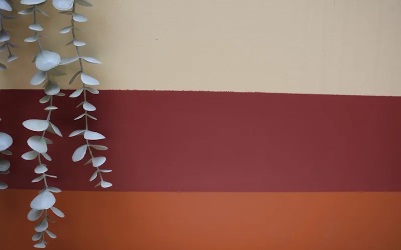
- Terracotta and warm clay - These muted, earthy reds create feelings of warmth, groundedness, and comfort. They work beautifully in living rooms and dining spaces, and pair naturally with handcrafted ceramic vases and wooden accents.
- Burnt orange and amber - Energizing yet cozy, these tones stimulate conversation and appetite. Ideal for social spaces and kitchens.
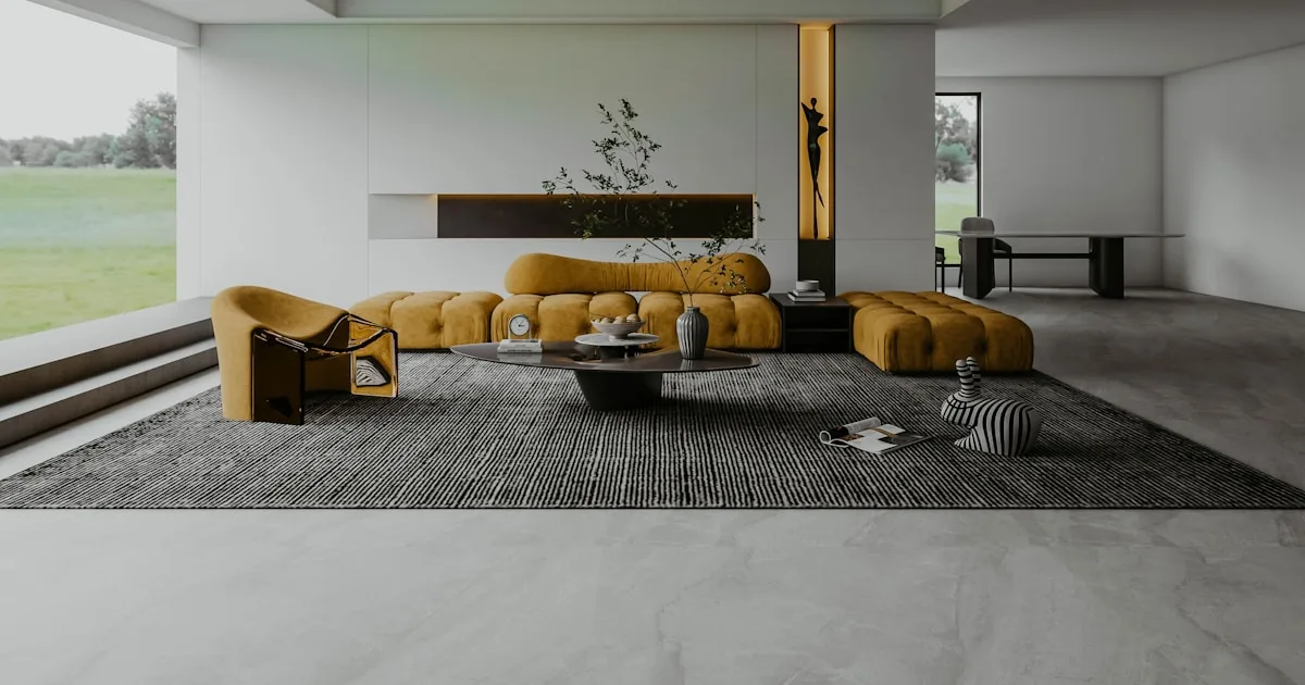
- Soft gold and mustard - Optimistic and welcoming without being overwhelming, perfect as accent colors in entryways and breakfast nooks.
Cool colors - blues, greens, purples:
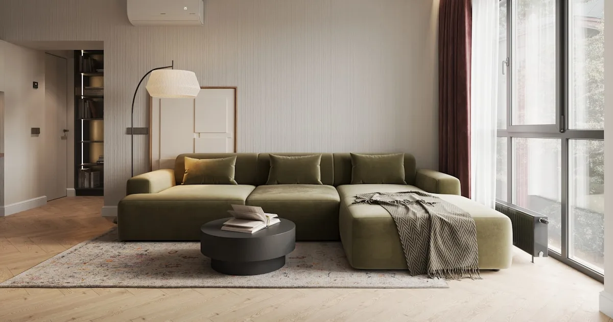
- Sage green and olive - Calming and nature-connected, these greens reduce stress and create a sense of renewal. They are among the most versatile wall colors for spaces filled with natural materials.
- Soft blue and dusty blue - Promotes tranquility and focus. Excellent for bedrooms and home offices where rest and concentration are priorities.
- Deep navy and charcoal blue - Sophisticated and dramatic, these tones create intimate, cocooning spaces when used on accent walls.
Neutrals - whites, grays, beiges:
- Warm white - The safest, most universally flattering wall color. Warm whites with yellow or pink undertones make natural wood and rattan furniture glow.
- Greige (gray-beige) - A modern neutral that works in every room and pairs effortlessly with both cool and warm accent pieces.
- Mushroom and taupe - Richer neutrals that add depth without competing with furniture and decor accessories.
When selecting paint colors, always consider the room's natural light. North-facing rooms benefit from warmer tones to counteract cool light, while south-facing rooms can handle cooler colors without feeling cold. East-facing rooms receive warm morning light and cool afternoon light, making them ideal candidates for balanced, neutral palettes.
Interior Paint Color Schemes That Work Every Time
Choosing a single wall color is one thing - creating a cohesive whole-home color scheme is another. A well-planned color scheme ensures that moving from room to room feels harmonious rather than jarring. Here are five proven approaches to interior paint color schemes.
1. The 60-30-10 rule:
This classic formula divides a room's color into three proportions: 60% dominant color (walls), 30% secondary color (furniture, rugs, and large textiles), and 10% accent color (cushions, vases, art, and small accessories). This ratio creates visual balance naturally. For example: warm white walls (60%), natural wood and linen furniture (30%), and terracotta and sage green accents (10%).
2. Tonal color scheme:
Choose one color family and use it in varying shades throughout the home. A tonal green scheme might use sage on living room walls, soft mint in the bedroom, deep forest green in the study, and olive green accents in the kitchen. This creates cohesion while allowing each room to have its own character.
3. Complementary contrast:
Pair colors from opposite sides of the color wheel for dynamic energy. Soft blue walls with warm terracotta accents, sage green walls with dusty rose textiles, or charcoal walls with warm brass and amber lighting. The contrast creates visual interest while the muted tones keep things sophisticated.
4. Nature-inspired palette:
Look to natural landscapes for color combinations that feel inherently harmonious. A coastal palette (sandy beige, ocean blue, driftwood gray), a forest palette (deep green, warm brown, misty white), or a desert palette (terracotta, sand, dusty pink) all work beautifully because nature has already proven these combinations.
5. Flow-through neutrals:
Paint hallways, transitions, and common areas in a warm neutral, then let individual rooms express personality through deeper or bolder shades. This creates a calm backbone for the home while allowing each space to have its own mood. The neutral flow-through also lets natural materials - rattan, wood, and woven textures - serve as the consistent visual thread.
Accent Wall Design: How to Create a Focal Point with Paint
An accent wall is one of the most impactful interior painting techniques - a single wall painted in a contrasting or deeper color to create a focal point that anchors the room. When done well, an accent wall adds drama, depth, and architectural interest without overwhelming the space.
Choosing the right wall:
Not every wall is a good candidate for an accent treatment. The best accent walls are those that naturally draw the eye - the wall behind a bed headboard, the wall a sofa sits against, a fireplace wall, or the wall you see first when entering a room. Avoid walls with too many doors, windows, or interruptions that fragment the color's impact.
Color selection for accent walls:
The accent wall should be darker or more saturated than the surrounding walls, but within the same color family or complementary to it. If your other walls are warm white, consider a deep sage green, rich terracotta, warm charcoal, or dusty navy for the accent. The contrast should feel intentional and dramatic but not jarring.
Dark accent walls with natural decor:
Dark accent walls - deep green, charcoal, navy, or even black - create a stunning backdrop for natural materials and handcrafted objects. A deep green wall behind a shelf of ceramic vases makes each piece stand out like sculpture. Dark walls paired with light-colored rattan furniture and warm wood create sophisticated contrast that feels modern and inviting.
Warm accent walls:
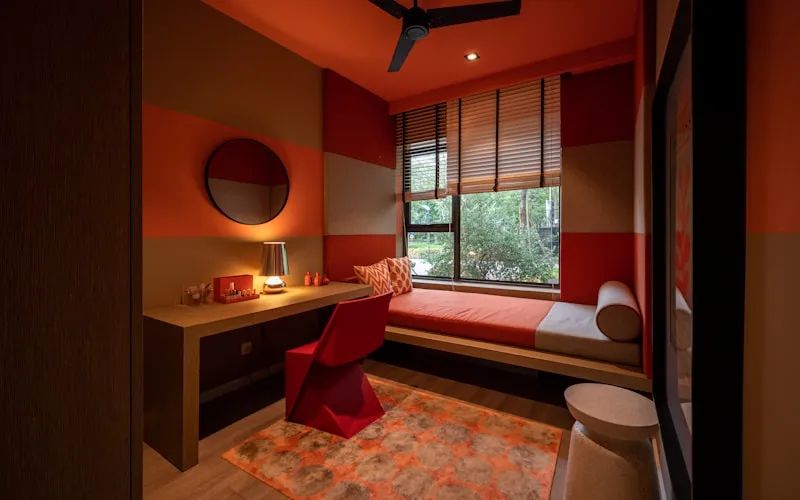
Terracotta, burnt sienna, and warm clay accent walls have surged in popularity for good reason - they create instant warmth and pair perfectly with natural materials. A terracotta accent wall behind a bed, styled with linen bedding and wooden bedside tables, creates a Mediterranean-inspired retreat.
Going beyond flat color:
- Half-wall painting - Paint the lower half of the wall in a deeper color with a clean, horizontal line. This adds architectural interest to rooms with plain walls.
- Arched shapes - Paint a large arch shape on the wall behind a bed or desk for a soft, modern focal point.
- Color blocking - Use geometric shapes of different but coordinated colors for a bold, contemporary statement.
Advanced Interior Painting Techniques & Finishes
Beyond flat, solid color, there are numerous painting techniques that add texture, depth, and visual interest to walls. These techniques can elevate a room from simply painted to genuinely designed.
Limewash:
Limewash has become one of the most sought-after paint techniques in modern interior design. Made from slaked limestone, limewash creates a soft, chalky, slightly uneven finish that adds remarkable depth and movement to walls. The slight variations in color and opacity give walls an aged, European quality that flat paint simply cannot replicate. Limewash in warm white or soft pink pairs extraordinarily well with rustic, handcrafted furniture and natural decor.
Mineral paint (silicate):
Like limewash, mineral paint bonds with the wall surface to create a natural, breathable finish. It has a subtle matte texture that flatters natural light and provides a beautiful backdrop for artisan accessories and natural materials.
Color washing:
This technique involves applying a translucent glaze over a base coat using broad, sweeping strokes with a large brush or cloth. The result is a soft, watercolor-like effect with subtle variations in tone. Color washing in earthy tones - terracotta, sand, or sage - creates walls that feel alive and organic.
Sponging and ragging:
Using a sea sponge or bunched-up rag to apply or remove a glaze coat creates a dappled, textured effect. When done in subtle, tonal variations - creamy beige over warm white, for example - the technique adds sophisticated texture without overwhelming the room.
Paint finishes and where to use them:
- Matte / flat - Ideal for living rooms, bedrooms, and any space where a soft, non-reflective surface is desired. Hides wall imperfections well. Pairs beautifully with natural, textured decor.
- Eggshell - A slight sheen that is more durable and easier to clean than matte. Excellent for hallways, family rooms, and dining spaces.
- Satin - More reflective, creating a subtle glow. Best for kitchens, bathrooms, and trim where moisture resistance is important.
- Semi-gloss and gloss - Highly reflective and durable. Reserve for trim, doors, and cabinets rather than full walls.
When choosing a finish, consider how it interacts with your decor. Matte walls allow natural textures - wood grain, rattan weave, linen - to be the stars. Glossy walls compete with these textures and can make a room feel more formal than intended.
Pairing Paint Colors with Natural Furniture & Handcrafted Decor
The relationship between wall color and furniture is where interior painting design truly comes alive. The right paint color can make a piece of handcrafted furniture sing; the wrong one can make it disappear or clash.
Paint colors that complement natural wood:
Natural wood furniture - whether light oak, warm walnut, or rustic teak - looks its best against walls that enhance its grain and warmth. Warm whites, soft sage green, dusty blue, and mushroom gray all provide a complementary backdrop. Avoid pure white or cool gray, which can make warm-toned wood look yellowish or out of place.
The best wall colors for rattan furniture:
Rattan's golden, honey-toned warmth pairs beautifully with soft white, cream, sage green, dusty pink, and light terracotta. For a more dramatic look, deep navy or forest green walls make rattan glow by contrast. The key is choosing colors that highlight rattan's natural warmth rather than cooling it down.
Creating backgrounds for artisan decor:
If you have a collection of handcrafted vases, ceramics, or woven objects you want to showcase, the wall behind them matters enormously. Dark, solid walls (charcoal, deep green, navy) act like gallery walls, making each object pop. Lighter, textured walls (limewashed white, color-washed sand) provide a softer, more integrated backdrop.
Color and lighting interaction:
Wall color dramatically affects how light behaves in a room. Warm-toned walls (beige, terracotta, gold) amplify warm lamplight, creating a cozy golden glow. Cool-toned walls (blue, green, gray) enhance natural daylight. Consider what kind of lighting dominates your space - warm incandescent, neutral LED, or cool natural light - and choose paint colors that work with that light source.
Practical combinations we love:
- Warm white walls + natural rattan + terracotta accents = relaxed Mediterranean feel
- Sage green accent wall + light wood furniture + brass lamps = sophisticated natural calm
- Deep charcoal wall + light rattan + white linen = modern dramatic contrast
- Soft mushroom walls + dark wood + ceramic vases = earthy, grounded elegance
Room-by-Room Interior Painting Guide
Each room in your home has different functions, lighting conditions, and emotional needs. Here is a room-by-room approach to choosing the right interior paint colors.
Living room:
As the most social space in the home, the living room benefits from warm, welcoming colors. Warm white or soft beige on most walls with a deeper accent wall - terracotta, sage green, or warm gray - creates depth without overwhelming. These tones complement natural materials beautifully, allowing rattan furniture, woven baskets, and wooden pieces to feel at home.
Bedroom:
Prioritize calm and rest. Soft, muted tones - dusty blue, sage, lavender, or warm blush - promote relaxation. If you prefer neutrals, a creamy warm white with a touch of pink or peach undertone creates a cocoon-like warmth. Avoid pure white and cool grays, which can feel stark and unwelcoming at night. A darker accent wall behind the bed adds depth while keeping the overall atmosphere serene.
Kitchen:
Kitchens need colors that feel fresh and energizing. Warm white remains the most popular choice for its clean, bright quality, but soft green, gentle blue, or warm terracotta on a feature wall can add personality. Choose satin or eggshell finishes for their durability and ease of cleaning.
Home office:
Colors that promote focus and creativity are ideal here. Soft sage green boosts concentration without causing eye strain, while warm gray provides a professional backdrop that photographs well on video calls. A deeper accent wall can add personality without distraction.
Bathroom:
Small, often windowless bathrooms benefit from lighter colors that maximize the sense of space. Warm white, very soft blue, or the palest sage create freshness. If you have a well-lit bathroom, a bolder choice like deep teal or warm terracotta can transform it into a spa-like retreat.
Hallways and entryways:
These transitional spaces connect rooms, so their color should flow naturally from one space to the next. A warm neutral - soft beige, greige, or mushroom - provides a cohesive backdrop that ties the home together. These are excellent spaces to hang artisan accessories and display vases against a flattering neutral wall.
Interior painting design is where art meets architecture - a discipline that combines color theory, technical skill, and an understanding of how spaces make us feel. The right paint colors can transform not just the look of your home but the way you experience it every day.
Start with the fundamentals: understand your light, choose a cohesive palette, and use the 60-30-10 rule to balance color proportions. Then layer in techniques like accent walls and specialty finishes to add depth and character. Most importantly, choose colors that complement your furniture and decor - walls should enhance the beautiful pieces in your home, not compete with them.
Explore our collections of handcrafted vases, artisan lamps, and natural accessories to find pieces that will bring your freshly painted rooms to life.
Frequently Asked Questions
Enjoyed this guide?
Share it with someone who'd find it useful